|
Benjamin Vago, Daniel Archambault, Alessio Arleo, "DynTrix: A Hybrid Representation for Dynamic Graphs",
Computer Graphics Forum, vol. 43, 2024.
paper |
|
Ignacio Baltazar Pérez Messina, Davide Ceneda, Victor Schetinger, Silvia Miksch, "Persistent Interaction: User-Generated Artefacts in Visual Analytics",
EuroVis Workshop on Visual Analytics (EuroVA), 2024.
paper |

|
Michaela Tuscher, Velitchko Filipov, Teresa Kamencek, Raphael Rosenberg, Silvia Miksch, "Mapping the Avantgarde: Visualizing Modern Artists' Exhibition Activity",
EuroVis 2024 - Short Papers, 2024.
paper |
| |
Fabian Sperrle, Mennatallah El-Assady, Alessio Arleo, Davide Ceneda, "A Wizard of Oz Study of Guidance Strategies and Dynamics",
IEEE Transactions on Visualization and Computer Graphics, 2024.
paper |
| |
Velitchko Filipov, "Dynamic Perspectives: Visualizing Time and Networks for Analytical Insights",
Shonan Meeting 189: Advancing Visual Computing in Materials Science, 2024.
|
| |
Velitchko Filipov, ""Networks in Time and Space, Visual Analytics of Dynamic Network Representations"",
Institute of Visual Computing and Human-Centered Technology, pp. 197, 2024.
|
|
Nikolaus Piccolotto, "Visual Analytics for Blind Source Separation in Time and Space",
Institute of Visual Computing and Human-Centered Technology, pp. 325, 2024.
|
| |
Luca Rauchenberger, "Dynamic Network Analysis with Centrality Measures",
Institute of Visual Computing and Human-Centered Technology, pp. 104, 2024.
|

|
Ignacio Baltazar Pérez Messina, Davide Ceneda, Silvia Miksch, "Enhancing Visual Analytics systems with guidance: A task-driven methodology",
COMPUTERS & GRAPHICS-UK, vol. 125, pp. article no. 104121, 2024.
|
|
Silvia Miksch, Claudio Di Ciccio, Pnina Soffer, Barbara Weber, "Visual Analytics Meets Process Mining: Challenges and Opportunities",
IEEE Computer Graphics and Applications, vol. 44, pp. 132-141, 2024.
|
|
Velitchko Filipov, Alessio Arleo, Tatiana von Landesberger, Daniel Archambault, "Back to the Graphs: A Collection of Datasets and Quality Criteria for Temporal Networks Layout and Visualization",
, 2023.
|
|
Teresa Kamencek, Velitchko Filipov, Victor Schetinger, Silvia Miksch, Raphael Rosenberg, "TimeScapes: Towards a Visual Characterization of Modern Artist Exhibition Activity",
, 2023.
|
| |
Adam Nedas, "Utilizing visual analytics for network exploration in the domain of art history research",
Institute of Visual Computing and Human-Centered Technology, pp. 123, 2023.
|
| |
Philipp Klein, "Reimagining design: Exploring the potential of the infinite canvas for collaborative interactive articles",
, pp. 123, 2023.
|
| |
Marina Haller, "What do wind farms look like? Visualizing global wind farms",
, pp. 95, 2023.
|
|
Silvia Miksch, "Visual Analytics Meets Temporal Reasoning: Challenges and Opportunities",
, vol. 247, pp. 1-2, 2022.
paper |
|
Davide Ceneda, Alessio Arleo, Theresia Gschwandtner, Silvia Miksch, "Show Me Your Face: Towards an Automated Method to Provide Timely Guidance in Visual Analytics",
IEEE Transactions on Visualization and Computer Graphics, vol. 28, pp. 12, 2022.
|
|
Natalia Andrienko, Gennady Andrienko, Silvia Miksch, Heidrun Schumann, Stefan Wrobel, "A Theoretical Model for Pattern Discovery in Visual Analytics",
Visual Informatics, vol. 5, pp. 20, 2021.
|
| |
Thomas Anderl, "Identifying GitHub trends using temporal analysis",
Institute of Visual Computing and Human-Centered Technology, pp. 68, 2021.
|
| |
Roger Leite, "Events analysis in visual analytics",
Institute of Visual Computing and Human-Centered Technology, pp. 133, 2021.
|
| |
Lisa Müllner, "Knowledge-assisted visual analytics: data exploration and insight generation of health care data",
Institute of Visual Computing and Human-Centered Technology, pp. 94, 2021.
|
|
Victor Schetinger, Kathrin Raminger, Velitchko Filipov, Nathalie Soursos, Susana Zapke, Silvia Miksch, "Bridging the Gap between Visual Analytics and Digital Humanities: Beyond the Data-Users-Tasks Design Triangle",
, 2020.
|
|
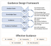
Davide Ceneda, Natalia Andrienko, Gennady Andrienko, Theresia Gschwandtner, Silvia Miksch, Nikolaus Piccolotto, Tobias Schreck, Marc Streit, Josef Suschnigg, Christian Tominski, "Guide Me in Analysis: A Framework for Guidance Designers",
Computer Graphics Forum, vol. 39, pp. 19, 2020.
|
|
Christian Bors, Christian Eichner, Silvia Miksch, Christian Tominski, Heidrun Schumann, Theresia Gschwandtner, "Exploring Time Series Segmentations Using Uncertainty and Focus+Context Techniques",
EuroVis 2020, 2020.
|
|
Andreas Walch, Michael Schwärzler, Christian Luksch, Elmar Eisemann, Theresia Gschwandtner, "LightGuider: Guiding Interactive Lighting Design using Suggestions, Provenance, and Quality Visualization",
IEEE Transactions on Visualization and Computer Graphics (TVCG), vol. 26, pp. 10, 2020.
paper |