|
Natkamon Tovanich, Raphael Arthur Buchmüller, Velitchko Filipov, Fatih Öztank, Ignacio Baltazar Pérez Messina, Sandhya Rajendran, Wolfgang Aigner, Silvia Miksch, "Visual Analytics",
Wintergraph 2026, 2026.
|

|
Velitchko Filipov, "Networks In Motion : networks, diffusion, influence tracing, and what-if?",
Introduction at giCenter, 2026.
|

|
, "Visgames 2026: EuroVis Workshop on Visualization Play, Games, and Activities",
, 2026.
|
| |
Damir Dizdarevic, "Comparative Evaluation of Business Analytics and Visualization Tools and Applications",
Institute of Visual Computing and Human-Centered Technology, pp. 109, 2026.
|

|
Lisa Teichmann, Velitchko Filipov, "Between center and periphery: networks of translated German fiction authors in the German National Library",
Digital Scholarship in the Humanities, pp. article no. fqag041, 2026.
|
|
S. Di Bartolomeo, A. Dobler, Velitchko Filipov, M. Nöllenburg, Henry Ehlers, "The Story(line) So Far: A Survey on Storyline Visualization",
28th Eurographics Conference on Visualization (EuroVis 2026), vol. 45/3, pp. 30, 2026.
|

|
Velitchko Filipov, Tobias Isenberg, Alexander Lex, "README.md: A Tutorial on Reproducible Visualization Research",
28th Eurographics Conference on Visualization (EuroVis 2026), pp. 4, 2026.
|
|
Tom Baumgartl, M. Sondag, Velitchko Filipov, Michaela Tuscher, Sandhya Rajendran, Silvia Miksch, D. Archambault, Alessio Arleo, T. von Landesberger, "Survey on Visualization of Information Diffusion over Networks",
28th Eurographics Conference on Visualization (EuroVis 2026), vol. 45/3, pp. 42, 2026.
|

|
Sandhya Rajendran, Michaela Tuscher, Alessio Arleo, D. Archambault, Silvia Miksch, T. von Landesberger, Velitchko Filipov, "Happy Puzzles: Puzzle Games for Visualization Task Abstraction",
EuroVis 2026 - 28th EG Conference on Visualization, pp. 6, 2026.
|

|
Michaela Tuscher, Markus Bögl, "Visual Analytics",
Wintergraph 2025, 2025.
|

|
Tom Baumgartl, Mohammad Ghoniem, Tatiana von Landesberger, G Elisabeta Marai, Silvia Miksch, Sibylle Mohr, Simone Scheithauer, Nikita Srivastava, "Empowering Communities: Tailored Pandemic Data Visualization for Varied Tasks and Users",
IEEE Computer Graphics and Applications, vol. 45, pp. 130-138, 2025.
|

|
, "VisGames 2025: EuroVis Workshop on Visualization Play, Games, and Activities",
, 2025.
|

|
Wolfgang Aigner, Silvia Miksch, Franziska Proksa, Robert Sablatnig, Markus Seidl, Waldner, Manuela, Matthias Zeppelzauer, "Visual Heritage: Visual Analytics and Computer Vision Meet Cultural Heritage (doc.funds.connect)",
18. Forschungsforum Der Österreichischen Fachhochschulen, pp. 558-559, 2025.
|

|
Markus Passecker, Silvia Miksch, Franziska Proksa, Wolfgang Aigner, "The past is all around you: Augmenting cultural heritage on-site",
27th EG Conference on Visualization (EuroVis 2025 ), pp. 3, 2025.
|

|
Velitchko Filipov, Davide Ceneda, Daniel Archambault, Alessio Arleo, "TimeLighting: Guided Exploration of 2D Temporal Network Projections",
IEEE Transactions on Visualization and Computer Graphics, pp. 13, 2025.
|
| |
Anti Alman, Alessio Arleo, Iris Beerepoot, Andrea Burattin, Claudio Di Ciccio, Manuel Resinas, "Tiramisù: a recipe for visual sensemaking of multi-faceted process information",
Fourth International Workshop on Event Data and Behavioral Analytics, pp. 19-31, 2024.
|
|
Silvia Miksch, Claudio Di Ciccio, Pnina Soffer, Barbara Weber, "Visual Analytics Meets Process Mining: Challenges and Opportunities",
IEEE Computer Graphics and Applications, vol. 44, pp. 132-141, 2024.
|
| |
Adam Nedas, "Utilizing visual analytics for network exploration in the domain of art history research",
Institute of Visual Computing and Human-Centered Technology, pp. 123, 2023.
|

|
Bongshin Lee, Silvia Miksch, Anders Ynnerman, Anastasia Bezerianos, Jian Chen, Wei Chen, Christopher Collins, Michael Gleicher, Eduard Gröller, Alexander Lex, Bernhard Preim, Jinwook Seo, Ruediger Westermann, Jing Yang, Xiaoru Yuan, Han-Wei Shen, Jean-Daniel Fekete, Shixia Liu, "VIS 2021 - Preface",
IEEE Transactions on Visualization and Computer Graphics, vol. 28, pp. xiv-xxiii, 2022.
|

|
Silvia Miksch, "Visual Analytics Meets Temporal Reasoning: Challenges and Opportunities",
, vol. 247, pp. 1-2, 2022.
paper |

|
Velitchko Filipov, Alessio Arleo, Silvia Miksch, "Exploratory User Study on Graph Temporal Encodings",
, pp. 126-130, 2021.
|
| |
Thomas Anderl, "Identifying GitHub trends using temporal analysis",
Institute of Visual Computing and Human-Centered Technology, pp. 68, 2021.
|
|
Victor Schetinger, Kathrin Raminger, Velitchko Filipov, Nathalie Soursos, Susana Zapke, Silvia Miksch, "Bridging the Gap between Visual Analytics and Digital Humanities: Beyond the Data-Users-Tasks Design Triangle",
, 2020.
|
|
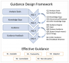
Davide Ceneda, Natalia Andrienko, Gennady Andrienko, Theresia Gschwandtner, Silvia Miksch, Nikolaus Piccolotto, Tobias Schreck, Marc Streit, Josef Suschnigg, Christian Tominski, "Guide Me in Analysis: A Framework for Guidance Designers",
Computer Graphics Forum, vol. 39, pp. 19, 2020.
|
|
Florian Windhager, Saminu Salisu, Roger Leite, Velitchko Filipov, Silvia Miksch, Günther Schreder, Eva Mayr, "Many Views Are Not Enough: Designing for Synoptic Insights in Cultural Collections",
IEEE Computer Graphics and Applications, vol. 40, pp. 58-71, 2020.
paper |