Cycle Plot for climate data
Problem
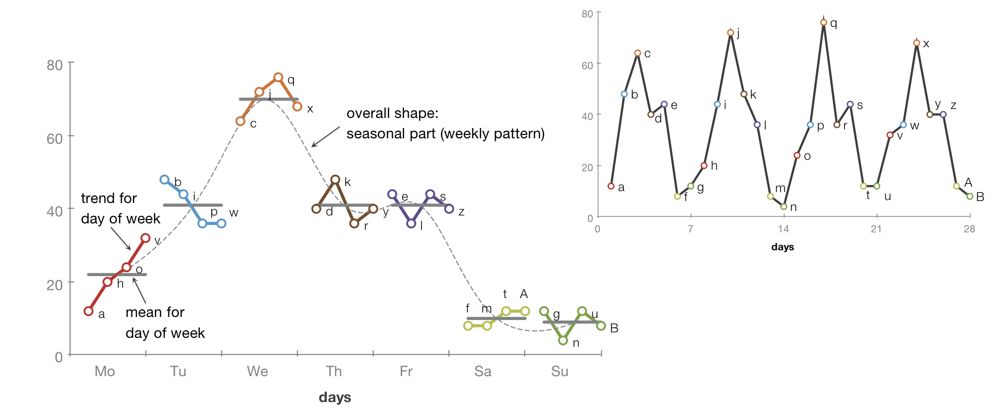
Time-series data may contain a seasonal as well as a trend component, which is also reflected in many statistical models. Cleveland (1993) describes cycle plots as a technique to make seasonal and trend components visually discernable. This is achieved by showing individual trends as line plots embedded within a plot that shows the seasonal pattern. In the figure, we see an increasing trend for Mondays, but a decreasing trend for Tuesdays. Additionally, the cycle plot shows the mean value for each weekday (depicted as gray lines). Connecting the mean val- ues as a line plot (dashed line in the figure) reveals the seasonal pattern, which in this case is a weekly pattern that clearly shows a peak on Wednesday.
In the context of this practical, the technique should be used to display climate data over time.
Aim
Prototypical implementation of the Cycle Plot using an existing framework for interactive visualization of time-oriented data that is based on prefuse
Other information
Information about prefuse:
InfoVis:Wiki
http://www.infovis-wiki.net/index.php?title=Prefuse
For beginners:
• Explore the demos in the online gallery http://www.prefuse.org/gallery/
• Download the toolkit www.prefuse.org
• Have a overview on the Prefuse classes
• Run the demos that come with Prefuse download.
• Read the user's manual: http://www.prefuse.org/doc/manual/ especially the introduction.
• Read and try out tutorials:
http://www.ifs.tuwien.ac.at/~rind/w/doku.php/java/prefuse-scatterplot
http://www.infovis-wiki.net/images/d/d7/Prefuse-tutorial-20061127-handout.pdf
http://www.cs.mun.ca/~hoeber/teaching/cs4767/notes/04-prefuse/
Die Javadoc API Documentation:
http://prefuse.org/doc/api/