TimeRider – Visualizing Patient Cohorts by Animated Scatter Plots
The aim of this project was to develop a program, which helps to show the development of medical parameters over time. These (30) parameters result from examinations of patients who are treated for diabetes. The examinations take place in irregular intervals from six weeks up to three months.
Visualization
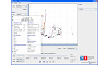
The visualization of the parameters was realized with a scatter plot, so each point in the graph represents an examination. The medical parameters are mapped to the axes of this plot and the user is able to change this mapping. In addition the parameters can be mapped to the colour, the shape and the size of the points.
Some parameters have a normal and a critical value range. The user can activate a view where the normal or the critical range is visualized with a blue background in the plot.
All changes in the configuration of the visualization cause the plot to refresh immediately.
The user is able to get more information about the points in the plot by moving the mouse accross them. A pop-up window with all available information about the examination (values of all parameters) appears.
If the user is interested in some special patients the user can select them by clicking on an examination of these patients. The selected patients are highlighted so the user can differentiate between selected and unselected patients easily.
Animation
The development of the parameters can be visualized with the animation functionality in a very comfortable way. The animation is controlled by media-player-like controls. There are two different ways to animate the data. The first view visualizes the development of the examinations with different transparencies. The second view shows expanding traces from one examination of a patient to another.
Transparency View
A point with no transparency (100% opacity) indicates that this examination is an actual one. This means that the examination's date is the currently visible date in the plot. In the course of time the transparency increases. To visualize the development of the parameters the examination points move to their next position (according to the value of the parameters for the x- and y-axes). If there is no successive examination the point stays on its position and will disappear after an defined number of days.
Trace Views
The user has the choice between two different trace views. The first view shows the traces with only the last examination point (the most recent examination) of the patients. This means that past examinations disappear if a more actual examination gets visible.
The second trace view shows the traces with all past examinations of the patients. In this view no past point will ever disappear.
Trace views do not use transparency for examination points. To differentiate between actual examinations and past examinations the actual examination points are bigger than the other ones. The trace also is thinner between older examinations and thicker between actual examinations.
In addition the user is able to change the synchronization of the animation data. There are four different synchronization modes. The first mode is the synchronization by the examination dates. This is the standard configuration. The second mode synchronizes the examinations by the first date of all examinations. So all patient's first examination starts at the same date. The third mode is equivalent to the second mode but the examinations are synchronized by the last date. The last mode is the synchronization by the age of the patients. This means that the user adjusts the age with the time slider and in the plot all examinations with this adjusted age get visible.
Filter
Filters are used to show only patients with selected properties. These properties are configured by adding filters. The program provides filter for every parameter and one filter to select patients which should be visible.
Insights
The user is able to save insights. All saved insights of the current session (a session starts with starting the program and ends by exiting the program) are displayed in the program. Every insight is associated with a screeshot so the user can have a look at the state of the program when he or she stored the insight.
Settings
If the user wants to use the current adjusted program settings in the future the user can save them. The "store-function" of the program saves all important program settings like adjusted axes parameters, added filters, current time, adjusted tempo, trace and synchronization mode, adjusted mappings to colour, shape and size and if the risklevels are are switched on or off and the adjusted ranges of the risklevel range. The user is also able to reset the settings. Then the Scatterplot is set to the initial program state.
Downloads
| >> start TimeRider prototype (via Java WebStart) | ||
| Filename: anscp.jnlp Needed application: Java JRE 6 |
Size: 1.5 MB |
|
| >> Slides for HCI International 2011 conference | ||
| Filename: TimeRider_HCII2011.pdf Needed application: PDF Viewer |
Size: 500 KB |
|
|
|
>> TimeRider video | |
| Filename: TimeRider_HCII2011.mp4 Needed codec: H.264/AVC |
Size: 7.0 MB |
|
Papers:
Rind, A.; Aigner, W.; Miksch, S.; Wiltner, S.; Pohl, M.; Drexler, F.; Neubauer, B. & Suchy, N.: Visually Exploring Multivariate Trends in Patient Cohorts using Animated Scatter Plots, M.M. Robertson (ed.), Ergonomics and Health Aspects of Work with Computers, Proceedings of the International Conference held as part of HCI International 2011, LNCS 6779, p. 139-148, Heidelberg, Springer, 2011. doi:10.1007/978-3-642-21716-6_15
Neubauer, B.: A comparison of static and dynamic visualizations for time-oriented data, Master Thesis, Vienna University of Technology, 2012.
Rind, A.; Neubauer, B.; Aigner, W. & Miksch, S.: Static and Dynamic Visual Mappings to Explore Bivariate Data Across Time, Matkovic, K. & Santucci, G. (eds.), EuroVA 2012 Poster Proceedings, p. 3, Eurographics, Vienna, Austria, 2012.
Related Work: