InfoVis Tools - A Detailed Comparison of Information Visualization Tools Using a Reference Data Set

This master's thesis uses a recently published categorization to perform a detailed comparison of several visualization tools, focusing on the temporal aspects of data. To judge the provided user support, several tasks are accomplished. Special emphasis is devoted to the problems and possible improvements of currently available information visualization tools and the evaluation of the employed categorization.
- Eva Wohlfart
- Alessio Bertone, Danube University Krems, Department of Information and Knowledge Engineering, Krems, Austria
- Silvia Miksch, Vienna University of Technology, Institute of Software Technology and Interactive Systems, Vienna, Austria
Many approaches to solve the problem of visualizing time-oriented data have been published in recent time, creating the need to categorize not only the methods to visualize time-oriented data but also the information visualization tools available on the market. Because of the difficulty of comparing such tools no agreement on a common categorization has been reached. This master's thesis uses a recently published categorization to perform a detailed comparison of several visualization tools, focusing on the temporal aspects of data. To judge the provided user support, several tasks are accomplished. Special emphasis is devoted to the problems and possible improvements of currently available information visualization tools and the evaluation of the employed categorization.
Information Visualization - Visual Programming
Due to the diversity of the examined applications a differentiation between information visualization tools and visual programming tools is made. Using visual programming environments, the user combines predefined modules to build a visualization application. Visual programming tools allow the direct manipulation and combination of the data fields.
The Data Set
The data set that is used to compare the information visualization tools was obtained from the UK National Air Quality Archive. Five measurement sites spread over the United Kingdom are included in the data set. Air pollutants compared are Carbon monoxide, Nitric oxide, Nitrogen dioxide, Ozone and Sulphur dioxide. The daily mean of each of these Pollutants from January the 1st 2002 until December the 31st 2006 is contained in the data set.
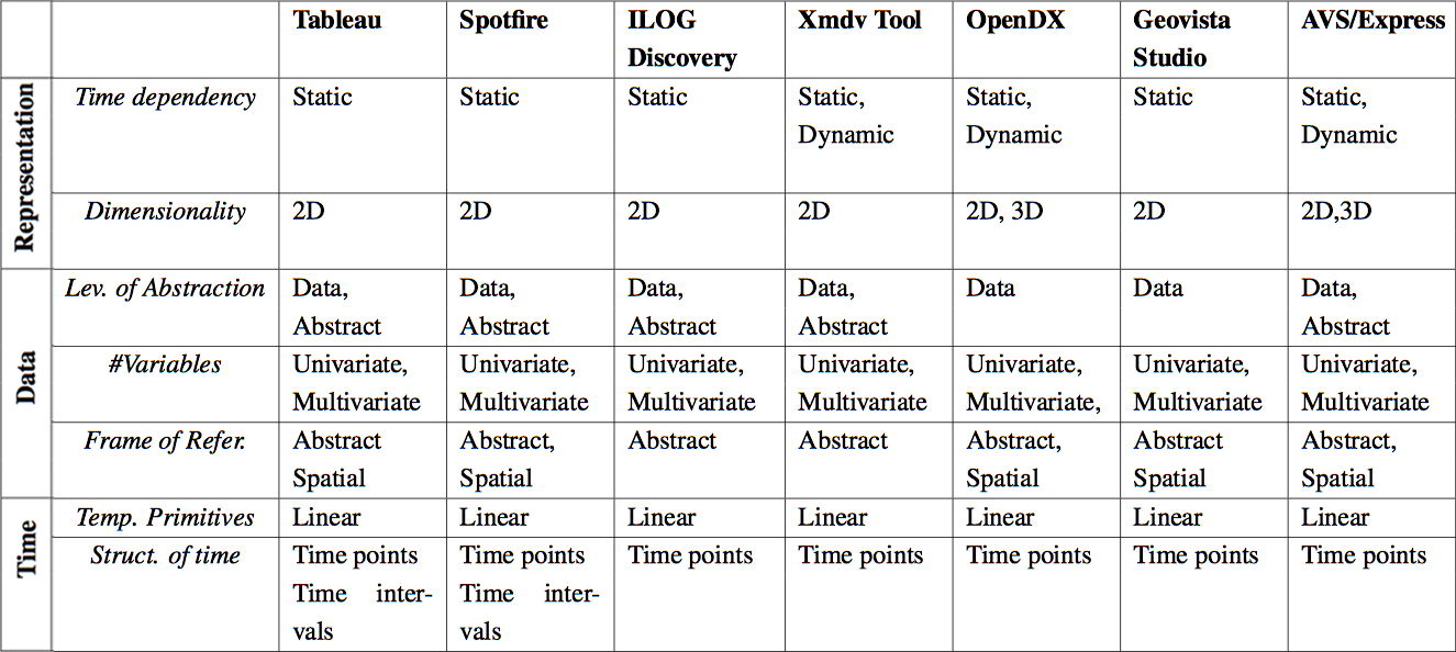
Empirical Comparison - Categorization
To provide a profound evaluation of the information visualization tools, both empirical tasks and a theoretical categorization are used. The defined tasks are selected to cover as much of the work in real life as possible and are accomplished with every application. The employed categorization builds upon three criteria: time, data and representation. Every tool is categorized to point out the differences between them.
Results
The input file could not be read in by any of the applications without applying some kind of conversion to it. Also, the size of the real-life data set caused problems. Most applications handle temporal data as a general sequence of values. The specific temporal information contained in the data is correctly recognized by only two visualization tools, but they strictly position the temporal events along a linear axis. Means for the discovery of periodicity would substantially improve the usability. All these results can be summarized in one sentence: due to the frequent relation of scientific data to the dimension time the awareness for the specific needs when displaying temporal data has to be raised.
Publications
- "Comparing Information Visualization Tools Focusing on the Temporal Dimensions", Proceedings of 12th International Conference on Information Visualisation (IV08), pp. 69–74, July, 2008.
 paper
paper - Wohlfart, E., "A detailed comparison of information visualization tools using a reference data set", Master's thesis, Vienna University of Technology, 2007.
- Visualizing time-oriented data - a systematic view, by Wolfgang Aigner, Silvia Miksch, Wolfgang Müller, Heidrun Schumann and Christian Tominski, Elsevier, 2007.
- Representation of temporal intervals and relations: Information visualization aspects and their evaluation, by Luca Chittaro and Carlo Combi, IEEE Computer Society Press, 2001.
- A unified taxonomic framework for information visualization, by Darius Pfitzner, Vaughan Hobbs and David Powers, Australian Computer Society, Inc. , 2003.
- An empirical comparison of three commercial information visualization systems, by Alfred Kobsa, IEEE Computer Society Press, 2001.