Guideline Overview Tool (GOT)

The main purpose of the Guideline Overview Tool (GOT) is to provide a compact overview that is easy to read and comprehend in order to support physicians in executing and analyzing therapies with clinical guidelines.
- Wolfgang Aigner, Vienna University of Technology, Institute of Software Technology and Interactive System, Vienna, Austria
- Silvia Miksch, Vienna University of Technology, Institute of Software Technology and Interactive System, Vienna, Austria
The main purpose of the Guideline Overview Tool (GOT) is to provide a compact overview that is easy to read and comprehend in order to support physicians in executing and analyzing therapies with clinical guidelines.
This overview has two main functions:
- Showing the actual state of a patient in relation to the assigned clinical guideline.
- Displaying several patients at one view in order to compare them.
1. Visualization of Plans
For the visualization of plans we use LifeLines [C. Plaisant and A. Rose, 1997; C. Plaisant et.al., 1998] because of their powerful possibilities and little vertical space consumption. For the reason of displaying parallel processes we expanded the model of LifeLines by using several vertically shifted line segments.
Plan States
In Asbru there are various states of a plan as described in the Asbru 7.2 Reference Manual [A. Seyfang et.al., 2000] at page 72. For the comparative visualization, the various plan-execution states are displayed. As an additional parallel view, also the plans in the state possible can be displayed.
The following Asbru plan states are supported by the visual representation:
|
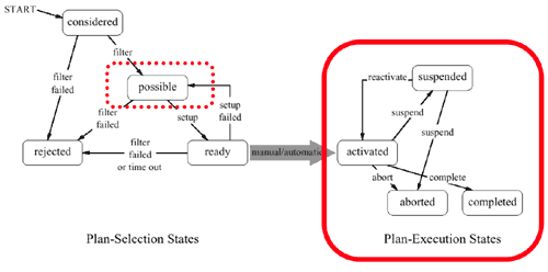 |
activated
A state transition to the plan state activated is shown by the sharp beginning of a bar for that plan. While a plan is activated it is shown as filled bar:

suspended
A transition of a plan to the state suspended is only possible via the state activated. Such a transition is displayed by a zigzag line. If a plan holds the state suspended it is displayed by a non-filled bar with dotted edges:

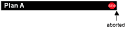
aborted
A transition of a plan to the state aborted is displayed by the sharp end of the bar and a stop sign within the bar (red octagon with white letters “STOP”). A plan can be aborted via the states active and suspended. If there is too little space to draw a stop sign it may be feasible to mark the end of the bar with a thick red line:
 or:
or: 
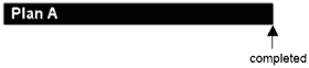
completed
The sharp end of the plan bar shows the transition of a plan to the state completed. There is just one possible predecessor state to completed, which is the state activated.
Subplans
In Asbru suplans are used to group plan steps in various temporal orders. (See Asbru 7.2 Reference Manual [A. Seyfang et.al., 2000] page 84 f.) In the following representations only plans in the states active and completed are shown.
sequential
The plans are performed in strict order. Each is started after its predecessor is finished. This grouping type is displayed by bars that are displayed side by side in a row:

parallel:
All steps or subplans are started at the same time. They may finish at any time. Parallel plans are displayed by bars one at the top of each other with the same starting point (x coordinate of the beginning of the bar):

any-order
The subplans are performed one at a time, without strict ordering. E.g., the second step can be performed before the first one, if appropriate, but at each instant in time, only one step is performed, i.e., their execution must not overlap. As soon as one subplan is suspended, another one is started. If the suspended plan is reactivated, it is resumed only after the plan started meanwhile is finished.
This type of plan grouping uses the same sort of display like the sequential plans.
>> see sequential
unordered
There is no ordering between the steps. They may overlap or not, and each may start and end whenever appropriate. The visualization of this grouping type uses a mix between the display types sequential respectively any-order and parallel:

Repetitive Plans
Asbru offers the possibility to create various repetitive plans (cyclic plan, for-each plan and iterative plan) where the plan body is repeated as specified.
Cyclic Plan
Cyclic plans are displayed by the repetition of the drawn plan bar with the same color and caption. (For more details about Cyclic Plans see Asbru 7.2 Reference Manual [A. Seyfang et.al., 2000] page 109 ff.)
For-Each Plan
The body of a For-Each Plan contains a number of plans that can be executed in following temporal orders: parallel, unordered or any-order. This means that they are displayed as described above in the Subplans section. (For more details about For-Each Plans see Asbru 7.2 Reference Manual [A. Seyfang et.al., 2000] page 114 ff.)
Iterative Plan
Simple sequentially executed loops are in Asbru modelled by an iterative plan. The display of the loop body is done in the same way as described in the Subplans section. (For more details about Iterative Plans see Asbru 7.2 Reference Manual [A. Seyfang et.al., 2000] page 117 ff.)
Caption
The bars are visually assigned to a plan by their caption. Therefore the title attribute of the element plan is used. If this attribute is not specified, the attribute name is displayed which is required in the plan definition.
Use of color
Most colors do have certain meanings in our culture. I.e., red means attention, caution, hot, stop; blue means cold; green means o.k., go on,… For this reason the use of color for plan bars is misleading and not useful. Plans do not have a semantic meaning per se, they are just a container for certain actions or processes. But it is necessary to have a way to distinguish between different plans and recognize if one plan is processed several times. Therefore we decided to use grayscale for the display of plans. Another possible solution would be the use of one color with changing the saturation for various plans. But as human perception is much better on distinguishing various shades ofgray, we decided to use grayscale.
Granularity
The structure of a plan is tree like. That means that each plan consists of a plan body where other plans are executed. These plans can contain other plans and so on. Simple actions are the leafs of this tree. When displaying all leafs of the executed plan, the screen would be cluttered and full of very small sections where you couldn’t recognize anything. Therefore we reduce granularity by only displaying at most seven plan bars at once. In the special case that seven plans are in parallel and there is not enough vertical available, fewer parallel bars are shown with an additional “…” sign for indicating that there are more plans which can be accessed by zooming in.
Expanded and collapsed view
Because vertical space is very valuable on the screen, a plan can be displayed in expanded and collapsed view. Expanded view means display like described above, thus bars with caption. Using the mouse one can change the view to collapsed mode, which means that all bars shrink vertically to two pixels of height and the caption disappears. This view consumes very little vertical space while preserving the overview of plans.
Expanded view
Collapsed view

Displaying the future
A further requirement for this tool is to show the course of plans in the future. This can be done by the element typical-duration of each plan. Plan selection takes places right after the predecessor plan stopped (preselection phase). That means that no exact course of plans can be carried out for the future. Because of the various possibilities future plans can be selected or not, future plans can only be displayed at a very global level due to our granularity restrictions.
Plans in the future are displayed as non-filled bars with dotted edges:

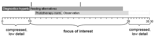
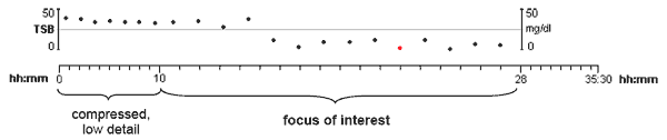
Fisheye view
For viewing parts of a plan at a very detailed level without losing the orientation in the whole plan fisheye view is very practical. That means that the area of interest is displayed at the decided precision and to the left and right of that section a compressed, low detail display of the surrounding is shown.
Example
Possible plans
Possible plans are displayed as a separate LifeLine in parallel to the really executed ones. Plans are in the state possible if they can be executed due to certain parameters and restrictions. The plan execution unit selects one of the various possible plans for execution. But also each other plan that was in the state possible could be selected at that point. Therefore it is valuable information to see which other plans could have been selected also.
Due to the fact that the display focuses on executed plans, possible plans are displayed in collapsed mode as default.
2. Visualization of Patient Data
In principle Asbru deals with three different types of values: parameters, variables, and constants. As you will see, only parameters can be displayed time dependent in parallel to the plan display.
Types / Time dependence
Parameters
Parameters are time-stamped values and the Asgaard framework explicitly models their changes over time. The Monitoring Unit stores their state at any point of time in the past. Parameters have a certain value range within they are valid. When values out of that range are entered, they are marked as invalid. There can also be a certain interval of time defined within a parameter remains valid. That means that an entered value remains valid as long as no new value is entered or the time interval runs out. Thereafter the parameter is marked as invalid.
Variables
The second type of values in Asbru is called variable. This type is not time-stamped and is therefore only for the current instant valid. They are not stored and no value of any point in the past can be accessed. Plan arguments do have the same properties as variables.
Constants
The third basic value type is called constants. Constants are fixed at their declaration and remain the same during the plan execution. Examples for constants are date of birth or sex.
Qualitative, time dependent display
If a parameter refers to a qualitative scale, it can also be displayed via LifeLines due to the mentioned advantages. In addition to an intuitive color mapping this form leads to a very simple display that is easy to understand. A parameter displayed by its qualitative scale is at its simplest form a LifeLine with color
sections representing a certain value of the scale. If a parameter gets invalid the bar is interrupted as long as the value remains invalid.
Use of color, color mapping
The most problematic issue of this display type is the color mapping. Because of the fact that most colors do have a certain meaning in our culture no automatic mapping can be performed without certain semantic knowledge about the scale entries. Asbru offers no possibility to add semantics in the definition of qualitative scales. Therefore we assume that there is a certain ontology that maps scale entries to colors. In addition it is possible to change this mapping due to the users needs.
Example
<qualitative-scale-def name="fever">
<qualitative-entry entry="no-fever"/>
<qualitative-entry entry="moderate-fever"/>
<qualitative-entry entry="high-fever"/>
</qualitative-scale-def>
Color mapping
| scale entry | color |
| no-fever | |
| moderate-fever | |
| high-fever |
LifeLine

Quantitative, time dependent display
Quantitative values are displayed as diagrams where values at a certain point of time are displayed as dots or other bullets. These data points can be connected via straight lines or even other methods like interpolation can be used. The display mode should be user driven and the default display provides just the data points.
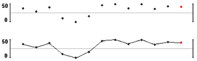
Displaying quantitative time dependent values is a problem due to very small useable vertical space. This problem can be solved by providing the possibility of resizing the diagram vertically or viewing just parts of the vertical scale. But all these possibilities should be user driven and not automatically be done. The default view should just give a feeling for the overall change of the value and not be used for exact data analysis. One advantage of the quantitative display is the possibility of showing several parameters within the same diagram area. Therefore one can view several parameters at once and gets information about certain relations between them.
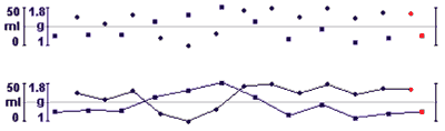
The specially marked data points (in this case the red ones) identify the currently valid or numerically displayed values. These values are displayed numerically in the panel for displaying variables and constants as described below.
Default display, switch between modes
If a parameter has both a quantitative and a qualitative scale, the qualitative one is displayed as default. Switching between modes is done by the mouse.
Expanded and collapsed view
Qualitative time dependent displayed values can be displayed in collapsed view as well. Qualitative values are shown in collapsed view as default. That means that the bar is shrunk to two pixels height as it is done in the collapsed view of plans:

When quantitative, time dependent values are displayed in collapsed view, only the points in time where measurements were taken are shown. This view doesn’t show anything about the value of a parameter but just shows when measurements were taken.

Granularity
A special problem of displaying time dependent parameters is their frequency in relation to the chosen time window. I.e., if you display very high frequency data in a time window of days or even month not every measured value can be displayed. Therefore we use the median function for displaying such parameters.
#
Fisheye view
As already mentioned in the Visualization of plans section, fisheye view leads to a detailed display at the focus of attention without losing orientation in the overall picture. For the display of quantitative values this means that values at the focus of attention are shown at decided precision and to the left and right of that focus the time scale is shrunk and only a few values with less granularity are shown. As qualitative values are displayed as LifeLines, this leads to the same result as the fisheye view of plans.
Which values are displayed?
Due to the vertical space limitations only very few time-dependent values can be displayed. We decided to display at most three parameters at once in collapsed qualitative mode or in one diagram panel in quantitative mode. Further we assume that there is a certain external ontology providing the program with the default displayed values for a given plan.
Variables and constants
As variables and constants are not time-stamped and no values of the past are stored only the currently valid values can be displayed. These values are displayed in a separate panel at the right side of the assigned LifeLines of one patient. The values are displayed as text and even to qualitative values no color mapping is provided.
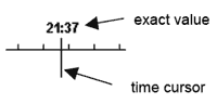
3. Time cursor
For selecting a certain point in time of interest a so-called time cursor is introduced. This time cursor is simply a vertical line that can be dragged per mouse. The exact position of the time cursor is shown numerically at the top and at the bottom of it. This time cursor triggers i.e. the currently numerically displayed values of a parameter (the marked data points of a diagram).
4. Time scale
One time scale that determines the displayed granularity is provided for all parallel shown LifeLines and diagrams. That is all displayed items are synchronized. This time scale is represented visually at the top and at the bottom of the screen.
Fisheye view
As described above fisheye view is used and therefore the time scale has no linear granularity. Vertical lines at the beginning and at the end and a white background display the area of focus. The border areas are shaded with a light color to provide the best contrast for the focus of attention. These areas are also draggable by mouse and so the focus of attention can be resized and moved.
Point of reference
There are two possible time scales for the display:
Plans and values assigned to real date and time
In this case the time scale represents real points of time – the point of reference is the earliest beginning of a displayed plan. Therefore two identical plans applied to two different patients and started at different points of time are shown shifted. One can compare states at certain points in real time but not values at certain plan states.
Plans and values assigned to the duration of plans
Here the time scale represents points in the duration of plans – the point of reference is the beginning of all plans. In this case one can compare plans and values at a certain point of plan execution but not states at a certain point of real date and time.
5. Panels and their order
Parameters and plans are displayed one on the top of each other having a panel handle at the left. This handle is a rectangle containing a triangle which indicates whether the display mode is expanded or collapsed. The mode can be changed by clicking this triangle. Further it should also be possible to reorder the panels, i.e., to display one qualitative value of all patients atop of each other for comparison. For the reason of easy assignment all panels of one patient do have the same background color as the variables and constant panel to the right.
6. Putting it all together
Basically the screen is divided into three main areas:
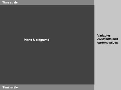
Time scale
This area is split up into two panels – one at the top and one at the bottom of the screen. It contains the time scale with its caption.
Plans & diagrams
That is the main part of the display, which contains the LifeLines and diagrams for the displayed patients.
Variables, constants and current values
This panel is located to the right of the Plans & diagrams area. It contains information about the patient (i.e. name, sex), certain variables and the numerically displayed parameter values.
7. Mockup
This example is taken from the “Asbru protocol for the Management of Hyperbilirubinemia in the Healthy Term New-born”: 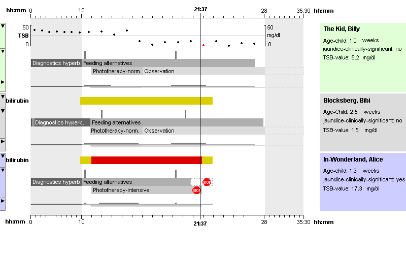
Figure 2: GOT mockup (Hyperbilirubinemia Protocol)
8. Prototype
A prototype for the designed plan display has been implemented using Squeak (a Smalltalk dialect) as proof-of-concept.
9. References
| [A. Seyfang et.al., 2000] | A. Seyfang, R. Kosara, and S. Miksch, Asbru 7.2 reference manual, Technical Report Asgaard-TR-2000-3, Vienna University of Technology, Institute of Software Technology, (2000). http://www.ifs.tuwien.ac.at/asgaard/asbru/asbru7 2 new/. |
| [C. Plaisant and A. Rose, 1997] | Catherine Plaisant and Anne Rose. Exploring LifeLines to Visualize Patient Records. University of Maryland. Human-Computer Interaction Laboratory. A.V. Williams Bldg. College Park MD 20782, http://www.cs.umd.edu/projects/hcil, Technical Reports CS-TR-3620 (1997). |
| [C. Plaisant et.al., 1998] | Catherine Plaisant, Richard Mushlin, Aaron Snyder, Jia Li, Dan Heller, and Ben Shneiderman. LifeLines: Using Visualization to Enhance Navigation and Analysis of Patient Records. University of Maryland. Human-Computer Interaction Laboratory. A.V. Williams Bldg. College Park MD 20782, . IBM T.J. Watson Research Center. In Proceedings of the 1998 American Medical Informatic Association Annual Fall Symposium, pages 76-80, 1998. |
| [A. Seyfang et.al., 2001] | Andreas Seyfang, Silvia Miksch, Mar Marcos, Combining Diagnosis and Treatment using Asbru, Vienna University of Technology, Institute of Software Technology, MedInfo 2001. |
Publications
- Guideline Overview Tool (GOT), , no. Asgaard-TR-2001-4: Vienna University of Technology, Institute of Software Technology & Interactive Systems, July, 2001.